How to Design a Better How
Most social good campaigns involve asking someone to change something. Eat healthier. Litter less. Move more. Typically, these campaigns also explain how. Eat healthier by getting five servings of fruits and veggies a day. Move more by “finding an activity you love.”
It’s in this moment – of explaining the “how” – that many campaigns lose their audiences.
That’s because most of us have heard these “hows” before. Many times over. We’ve been hearing we should eat five servings of fruits and veggies since we were old enough to spell “fruits” and “veggies.” We’ve been told to “find physical activities we love” by doctors, friends and fitfluencers across the internet.
If your campaign’s success depends on increasing your audience’s ability to take action, you can’t rely on overused, unengaging “hows.” In many cases, the “how” is quite literally where change happens.
But I’m not telling you to avoid any “how” that’s been used before. Often, they’re overused because they work. Instead, I’m challenging you to focus on the presentation. Present your “hows” in new, engaging ways. Approach the creation of your “how” with the same thoughtfulness, strategy and creativity that you use in the rest of your campaign.
I’m obsessed with designing the “how.” I have traveled down many Reddit rabbit holes and tried my hand at many obscure behaviors to present the “how” in fresh, engaging ways.
Here are my go-to moves:
Name it something new.
One of our clients is currently working with the Pacific Islander community in Washington state to help that community cut back on sugary drinks. The campaign involves a lot of tips for sipping less sugar. In those tips, we encourage the community to try “jeltzer” (a splash of juice mixed with seltzer) for a soda-like treat and to “serve water like a restaurant” (i.e., give a glass to every house guest upon arrival). We could’ve just said “trade soda for seltzer” and “serve a glass of water first.” But naming those familiar actions something slightly new reels the audience in to want to learn more and makes the “how” feel more fun and exciting.
Go from tip to tool.
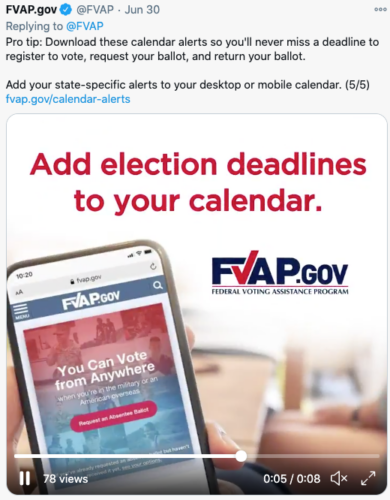
I do a lot of asking myself, “How can I transform this tip into a tangible tool for the audience.” We saw success with this approach for the Federal Voting Assistance Program, where we went beyond telling their audience of military and overseas Americans to “keep an eye on your state’s voting deadlines.” Instead, we created a widget that pushed state-specific voting deadline alerts to their phones and desktops.
But you don’t have to create a whole digital or physical tool. You can also provide tools by giving your audience specific actions to take in certain scenarios. Here are a few examples from our work promoting the 988 helpline in the Greater Baltimore region.
Make it fit like a glove.
Another way to transform a well-known “how” is to frame it in a way that fits your audience’s life like a glove. Your audience probably doesn’t need to hear “eat five servings of fruits and veggies a day.” They need to hear how to fit in five servings of fruits and veggies as a busy parent, or shift worker or a person with limited resources. You can also take it a step further by designing for your audience’s attitudes and beliefs. You’ll reel your audience in if the “how” feels highly custom and super doable for them.
Make it sticky.
Many social change campaigns require audiences to take repeated or regular action (e.g., visit the dentist every year or skip the fertilizer each summer). So it helps to make your “how” memorable. The name of the game here is keeping your “how” short, sweet and catchy.
And those are my top tips. Hopefully they help you give the “how” the design it deserves and drive meaningful change in your next campaign.

Meisha Thigpen is Creative Director at Marketing for Change.


